
First, I’d like to thank everyone involved in KDE for building such a great DE!
One of the features I love about KDE is the ability to have a multiline Icons-and-Text Task Manager. However, I think it could be improved even more. I wanted to share my thoughts and see what others think.
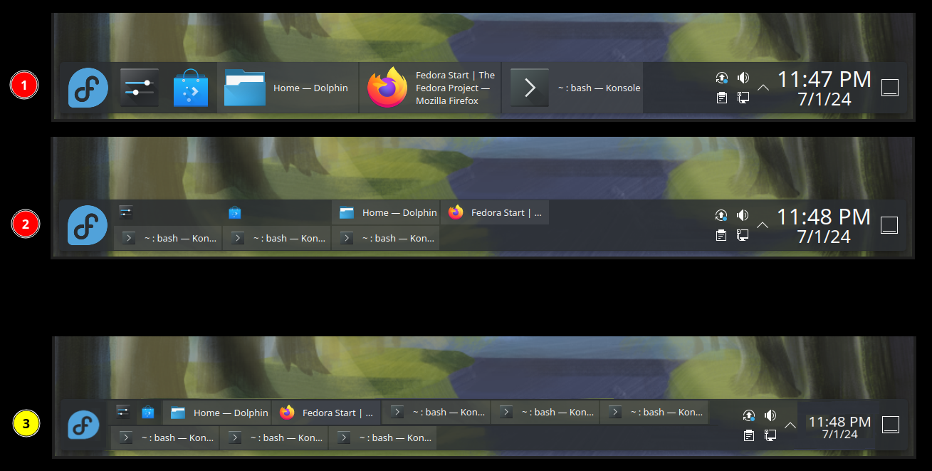
Please consider the attached image. In ① and ② we see what the taskbar looks like when ‘Maximum rows’ is set to 2. And ③ is a sketch I quickly made to illustrate what I am thinking of. In short:
- I imagine a layout that is more space-efficient and one that doesn’t try to look like a grid. Pinned icons don’t stretch.
- Instead of ‘Maximum rows’, we just have a fixed number of rows. And when the opened applications are just a few and they can fit in a single row, I think it would look better if they didn’t stretch and take up all the vertical space available, but just take the first row and leave the second one empty.
- If the Digital Clock and the Application Launcher icon could somehow be made smaller, there would be even more free space for other useful stuff and the taskbar would (arguably) look better.
What do you folks think?
The last result with it being double stacked tabs looks really cool actually. Im gonna try to use that later thanks!